The Museum of Printing History is rebranding.
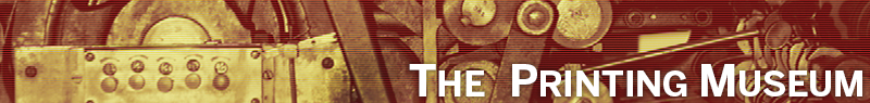
In today’s world of instant messaging, the world-wide web, and a seemingly unending explosion of information, there’s a perception that printed media may be heading the way of 16mm film or 8 track recordings. In response to today’s shifting tide, and in light of its 35 year history, the Museum of Printing History is excited to announce a fresh, new look and feel by unveiling a new brand identity as The Printing Museum.
This change to a more inclusive name better reflects the changing nature of printing in the 21st Century. Instead of focusing primarily on printing history, The Printing Museum celebrates the notion that printing is alive and well, showcasing not only historical artifacts, but also contemporary printed art and technologies.
Using a black and white palette, accented with process cyan and inspired by a midcentury modern aesthetic, the fresh identity breathes new life into a public image, while harkening to a vibrant past. Keeping conscious of our historical roots, the museum’s official typeface will be Benton Sans, designed by Tobias Frere-Jones. Benton Sans is based on original drawings held by the Smithsonian of News Gothic, a 20th Century standard designed for American Type Founders (ATF) by Morris Fuller Benton in 1903.
Spearheaded by Houston-based branding and design firm, Spindletop Design, this exciting new comprehensive project will unfold in phases, beginning this spring with the name changed to The Printing Museum and will continue into 2014. This project will involve logo and identity design, a new website, building graphics, and design of promotional materials.